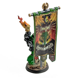
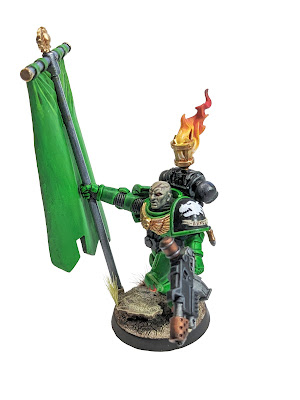
Maybe a little out of order, but the first test model comes to fruition...such as it is.
This poor guy had all the odds stacked against him. He started off as a super old Command Squad sprue I had laying around that was in terrible shape. The details were all gummy and nothing lined up properly. It was also the first mini I laid paint on after 3+ years away and since I didn't have high hopes for it I planned on it being the model I tested things out on while I knock off all the rust.
All told, I don't hate it. It's not gonna be gracing the pages of White Dwarf any time soon, but it looks good enough to an opponent from across the table. There's elements that came out pretty well. Others that are...not so good. But considering what it had going against it, I'm pretty happy with it.
A few of the firsts represented by this model:
- First model painted in 3+ years
- First time using contrast paints (ew...for green armor anyway)
- First attempt at Salamander skin
- First real attempt at blending on the flames in the brazier
- First freehand flames on the knee
- First self-printed decal
Well, that last one is a maybe. Certainly the first time on this particular machine. I've got access to a printer that can do decals. It could also probably print directly on the part, but that's a test for another day. The decal stock on it is pretty thick so it didn't lay down as nicely as I would've liked, and probably because of the thickness it also didn't respond to decal softener all that well. Probably 8-9 coats and I just gave up on trying to get it to fall in the wrinkles right up at the top. The banner was screen-grabbed from the digital codex, did a little Photoshop editing on to fix the proportions, etc.
But that blending- not too bad for a first attempt, if I say so myself. I learned a lot and the next time will be better. Same goes for the Salamander skin, which is kind of blending in itself. He's a little...ashy? I might try for a bit darker on the next one.
When I did the edge highlighting I hadn't gotten my brush control back yet. That's already much better on newer models I'm working on. I'm still struggling with my metallics. The gold in particular. It's Vallejo Old Gold alcohol metallic, and I love the stuff. Goes on looking great. Nice and opaque. But I haven't found the right tool for giving it depth. My old pot of GW Seraphim wash probably needs replacing, but I feel like most of their washes go over metallics looking a little cloudy and it just dulls the nice sheen of the metallic paint- at least they do on these Vallejo metallics. I tried some brown mixed with contrast medium and that's got some promise, but I haven't found the right brown yet. Will keep at it.
My Aggressor squad is nearing completion. Will hopefully have that ready next week.
~Deet


Reikland fleshshade gloss, my man! That's the secret sauce for shading gold metallics. Looking great so far, can't wait to see more.
ReplyDeleteI'll give that a shot. Sepia just looking ass
Delete